

Custom Application
Development Digital Marketing
and Integrated Solutions
Let Clever Solution’s team of experienced tech professionals take your business to the next
level with the latest digital solutions for online web development and marketing

Development Services
01Complex Solutions
Integrate your company’s software systems across your organization to optimize and streamline your business processes
CRM Solutions
Build customer loyalty and attract new business with high-performing Customer Relationship Management software
Web Solutions
Our Clever team of developers, project managers and designers use the latest web technologies to optimize your website’s performance
Support And Maintenance
Find your target audience and attract them to your brand with the latest digital marketing strategies that drive traffic to your website
Blockchain Services
02Blockchain Consulting Services
Customized blockchain solutions can help you transform your business concept into a successful venture based on your business objectives and vision. Our seasoned consultants take the guesswork out of blockchain development, saving you time and money, and helping to optimize your resources through feasibility analysis, use case identification and strategy development.
Blockchain Development
Blockchain revolutionizes business operations by eliminating intermediaries and fostering secure and efficient collaboration. Clever Solution provides top-tier customized Blockchain solutions based on years of experience in diverse industries.
Smart Contract Development
Smart contracts are immutable agreements between parties that eliminate fraud and promote transparency. Our customized smart contract development services help you effortlessly automate your blockchain transactions while remaining compliant with business regulations.
Tokenization Platforms
Clever’s premier tokenization services leverage blockchain technology to help clients monetize and manage their assets. Our experienced team can assist with customized tokens, token release, token registry, regulation of token currency, and more.
Blockchain-Integrated Mobile Apps
Blockchain enhances your mobile app by providing a safe and reliable environment for data, and for transparent and secure payment transactions. Blockchain-integrated apps are successfully used by financial institutions, insurance, healthcare, supply chain and many other industry sectors.
Our Technologies
03


Our Process
04


Portfolio
06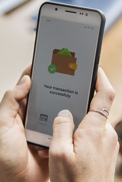

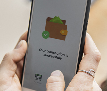
Type of Project: Mobile Application
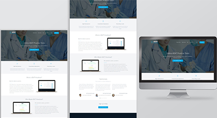
Type of Project: Corporate Website
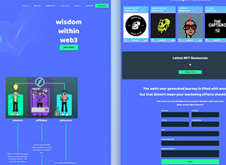
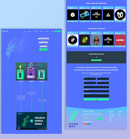
Type of Project: Portals and SAAS
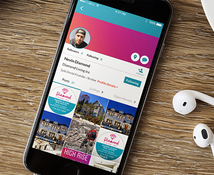
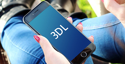
Type of Project: Mobile Application
Type of Project: Mobile Application
Our latest works:
Where creativity meets innovation
Get Started
with
Clever Solution
Get in touch
Fill out the form and our experts will Contact You
Phone+1 (888) 9595582

